Case Study: Milkywire x Mastercard PPC
Intro
Milkywire helps other companies mitigate their environmental impact with digital solutions, feedback and content, for example by integrating donation solutions to their web pages.
During this 5 week project the team consisted of 5 UX-designers helping Milkywire with research for their latest project, a website for: Priceless Planet Coalition. Where the user can read about Conservation Internationals cooperation with Mastercard and the different reforestation projects that are active throughout the globe.

Problem statement
How do consumers relate to the topic of reforestation?
What level of detail is important?
What type of communication is effectful?
What is considered a crucial factor for donors to make a donation? (or to donate)
What is relevant information for the users to make a decision on what to support?
How do consumers relate to a map experience to discover reforestation projects?
What information would be relevant to get after you have donated?
Our process
Three groups were formed through some card sorting of the problem statements.
Group 1: Trust.
How do we ensure the user that their money is being utilized properly?
Group 2: Information
How much information does the user need/want about different reforestation projects?
Group 3: Interaction
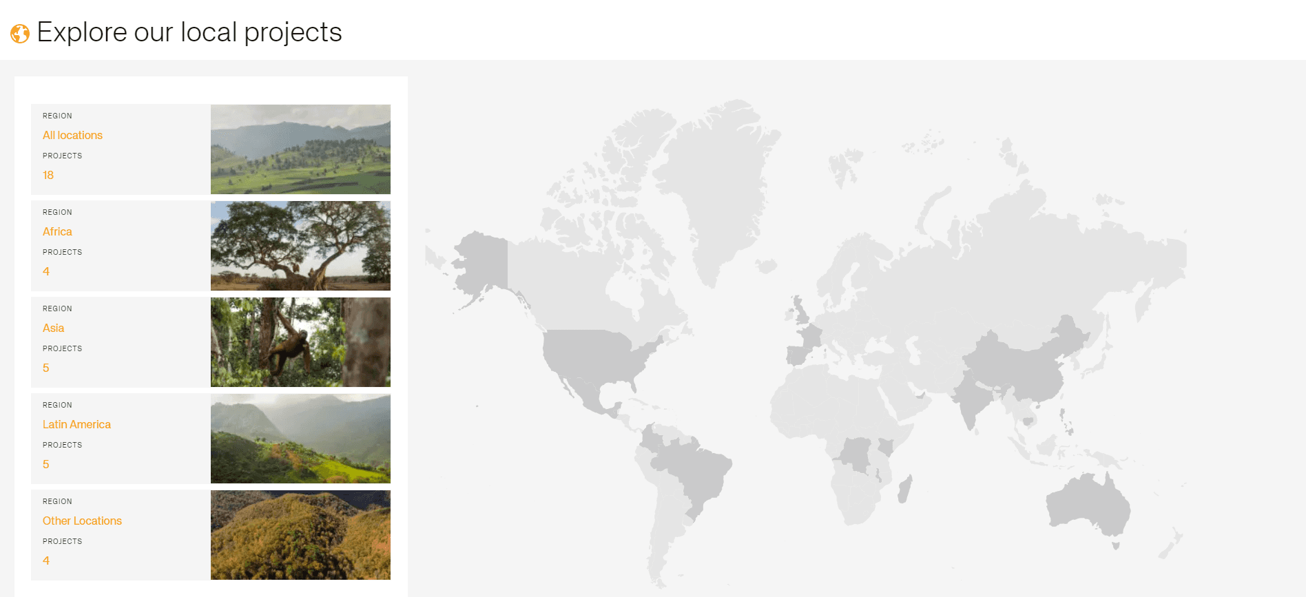
The website has a map where different projects can be seen around the globe. How is the user expected to use the map to find different pieces of information?

Qualitative research
The three groups merged into one guiding problem statement: How much information is needed on the different touchpoints for the user to trust that their money is going to the right place?
User testing
So how does a regular user react to the different aspects of this website and this map? User testing is a good tool to empathize with the user. When the user is seen live in action it becomes more clear what might pose an issue or serve as a reason to leave the site feeling annoyed.
The main scope with the user testing was the map. How does the user interact with it? If the map was going to be centered on the page it had to be done right. The main concern of the map was its intractability, it was unclear how to use it.
The structure used for the user tests was one-on-one, semi structured.
Some of the main findings were
The map wasn’t interactable interactable
Lack of information the user wanted to understand their money was spent in case they were to donate
Lack of instruction, the user felt confused and that the most important information was hidden
Quantitative research
Survey
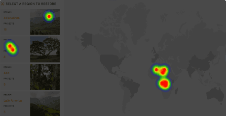
A survey, which included a first-click test with 17 respondents, revealed that 7 users attempted to interact with the non-interactive map. This underscored the importance of creating a fully engaging map experience.
Additionally, users wanted detailed reports on individual reforestation projects, not just project overviews. Hence, more information at the right place was requested/demanded.

Pooling the data together showed that the user wanted:
the map to be interactable
a more detailed presentation about each reforestation project
a better design for how to navigate around the site with buttons
an update on how the project they donated for is proceeding
And with that information being presented to the product team our project was completed.
Personal comments and learning points:
Working with a project which aims to help the globe could have felt like using holism as a buzzword but what I found was that this project opened my eyes to the impact I actually can have as a UX-designer.
Helping Milkywire to reach out with their important mission and educate more people about reforestation and as a consequence, impact society as a whole, made me realize that my work really could make a difference.
Since sustainability is such an important quest in this day and age which reforestation is part of, I sincerely hope this website gets done perfectly ‒ not just for my sake as a UX-designer but also, for the sake of the planet.
I am not a UX researcher. I do the research because you get interesting tidbits that you just didn't think about before, but this project really showed how important research can be. Without it we couldn’t have solved half of the issues, none of us would have guessed or even been close to guessing the other half of the issues. So after this I try to squeeze in user testing into every project, because it matters.