
Case Study: Axelsons
Chiropody
The treatment of the feet and their ailments.
Noun
Intro
Axelsons Institute provides courses in health and wellness and is the leading massage and chiropody school in the Nordic countries.
Axelsons aims to educate therapists so that massage and chiropody is readily available across Sweden and make the country as healthy as it can be.
During this 11 week project Axelsons entrusted us, a team of 6 UX-designers to use our expertise and help better elements of their website.
Research
Qualitative
During the research phase the team used different qualitative methods and the two that showed most was:
Usability testing
Interview with the customer service department
Problem statement
Some months Axelsons top over 100.000 visitors on their homepage and 30.000 to their education pages and their main issue was a lack of conversions

Usability testing
To truly get the idea of what a user thinks of a website one should use user testing as a method. In total we conducted 20 user tests. 10 on desktop and 10 on mobile.
Desktop
Too much text
The user misses out on key points
Mobile
Images on mobile resolution were poorly ported
Text too small
Both platforms shared multiple pain points for the user, mainly;
No clear typographic hierarchy
Too many choices
Overwhelming amounts of information
Information that appears twice
Event calendar is difficult to understand.
Interview with the customer service department
An interview with the customer service department showed that users call in to ask for information that is present on the website which showed us the obvious problem ‒ there is so much text that the user can’t find or doesn't bother looking for information.
Ideation
Through deskresearch, qualitative, and quantitative we unveiled the UX and UI issues that Axelsons had. Some correlated their difficult time with conversions and others were more general but they added up. Issues we uncovered:
Slow loading time
The website is not satisfying for the eye
Bad colour contrast at certain places
Annoying chatbot that is in the way
Scattered content
Unreadable calendar
Messy course information
Lack of testimonials
Unsatisfying banner at certain pages
Strong brand but little use of it
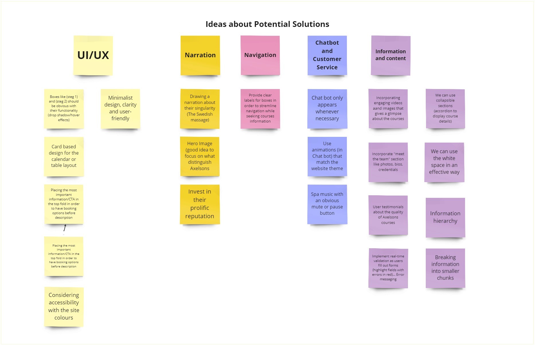
Card sorting
We took these issues and sorted them into categories to get a feel of what we felt were the most prominent issues.
Four groups of issues
Narration
Navigation
Information and content
UI/UX
Narration: Axelsons is a strong brand but this is not an element that they use on their website. If you can brag about your diploma being one of the strongest within massage and chiropody in the Nordic countries, why not do it?
Navigation: Provide clear labels for boxes in order to streamline navigation while seeking course information.
Information and content: Most of the information is mentioned twice or can be more effectively communicated. There is also a lack of information that fosters trust such as testimonials or a section to present the team.
UI/UX: there are several issues and recommendations for improvement that can enhance the overall user experience. Currently the user was provided with an unsatisfactory experience that would annoy them, and not meet Axelsons need of enhancing their conversions.
From here the team took different areas to focus on whilst still staying connected and collaborating. I took the lead of fixing the desktop user experience.
Design
I want to preface this part by saying that Axelsons website is not bad. They do not need an entire redesign. We worked with their design and aimed to improve what already existed. We did this by not creating a normal design system but working through atomic design. If you want to read more about it I would recommend this.
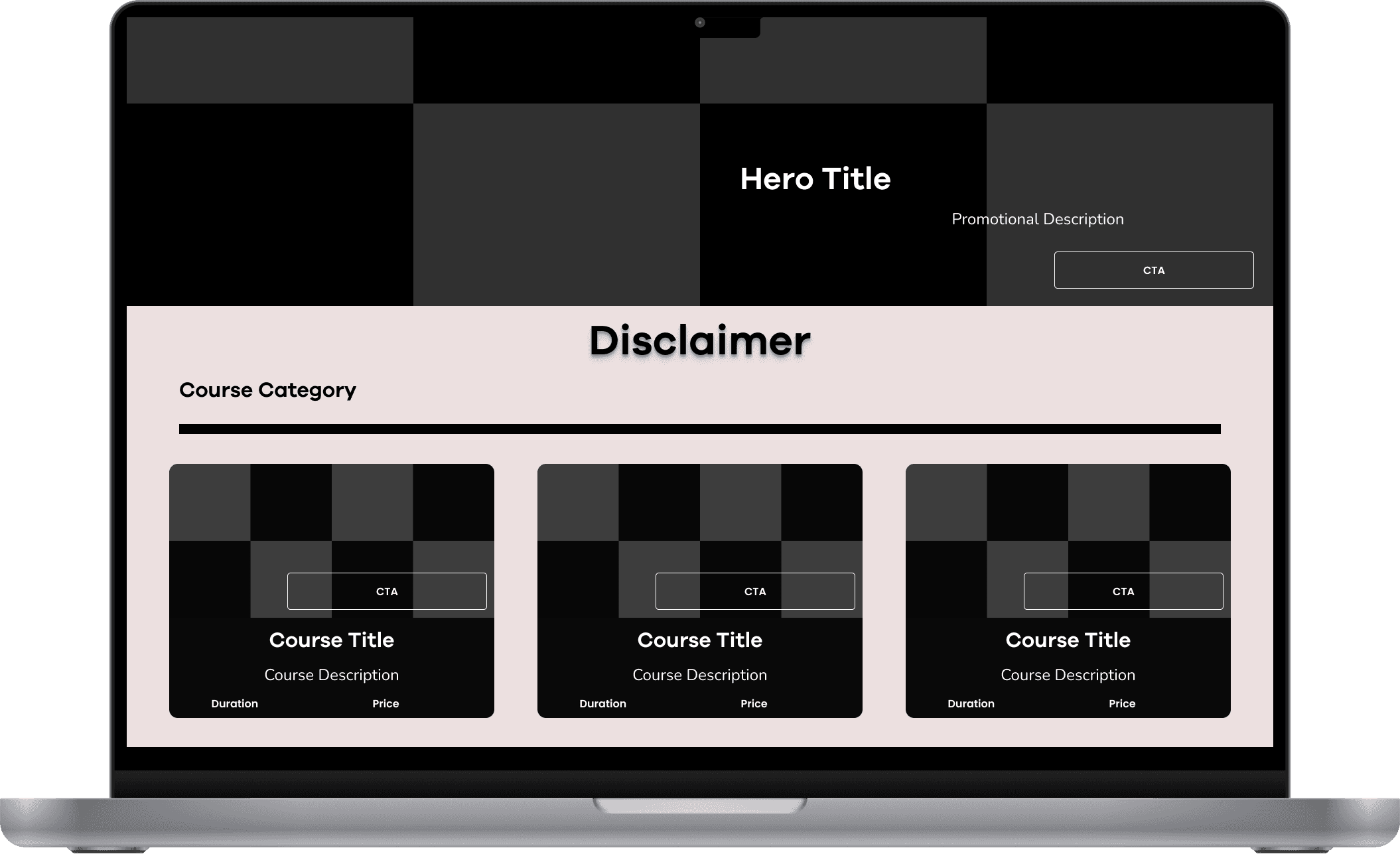
Lofi
We wanted to get an idea of how the entire page was going to look when the new elements had been added and old ones removed
Hi-Fi

Banner/CTA
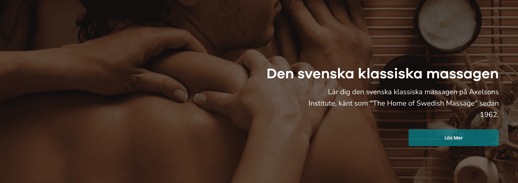
On the left you can see their previous hero image on the massage course page. Whilst it conveys the message of what page you are on there is not much more to it. On the right is our redesign which presents their flagship course “The Swedish classical Massage”, a small bio and a read more button. We also made the banner a bit bigger so the image could take its space and really show the picture of Swedish massage.



Buttons
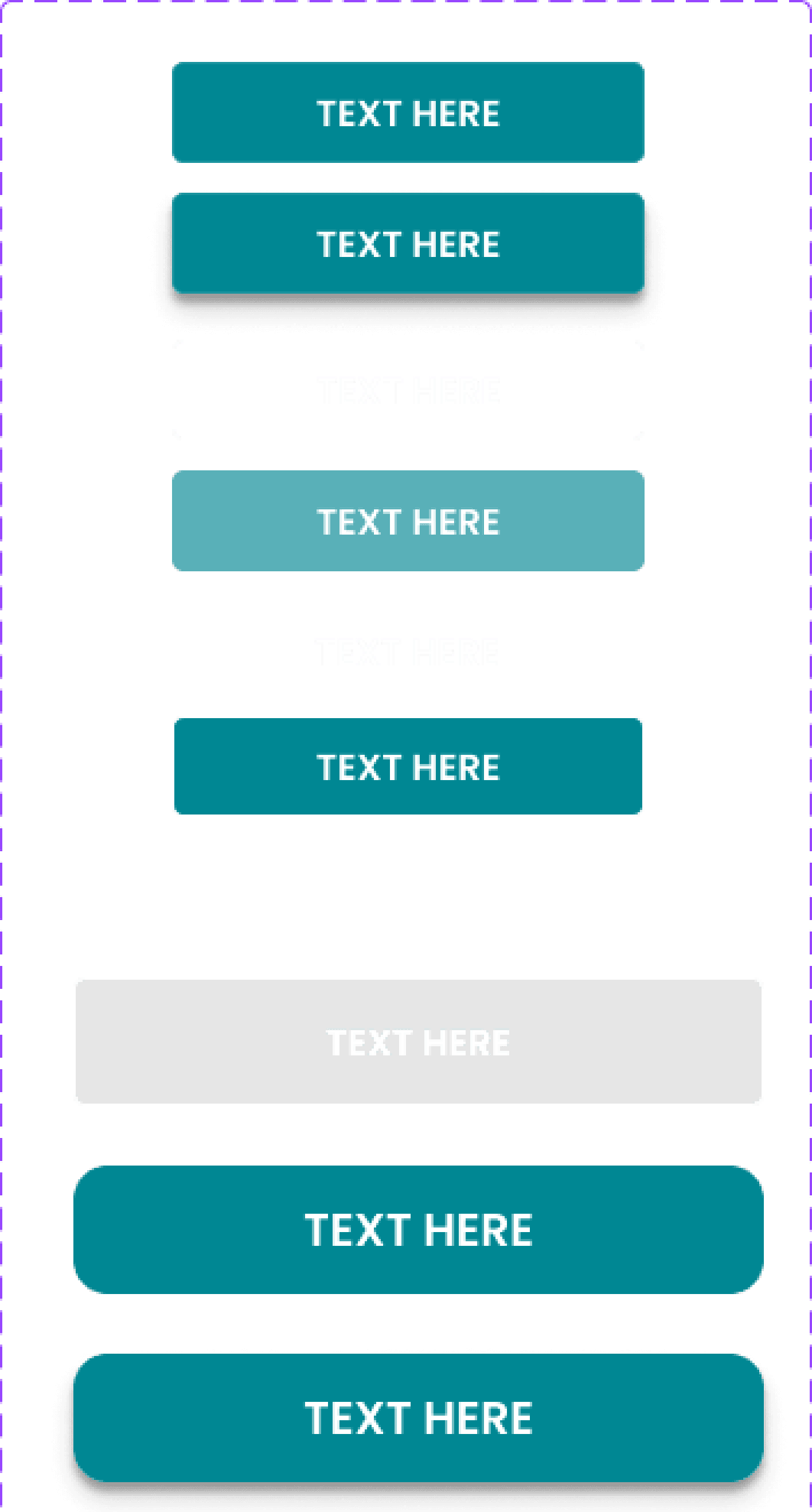
The old buttons were very chunky and didn't have that much padding even if their parent containers were a bit bigger. We made two sets of buttons, one smaller and one bigger and on both we added more padding so that they would fit the parent container better and not feel so small.

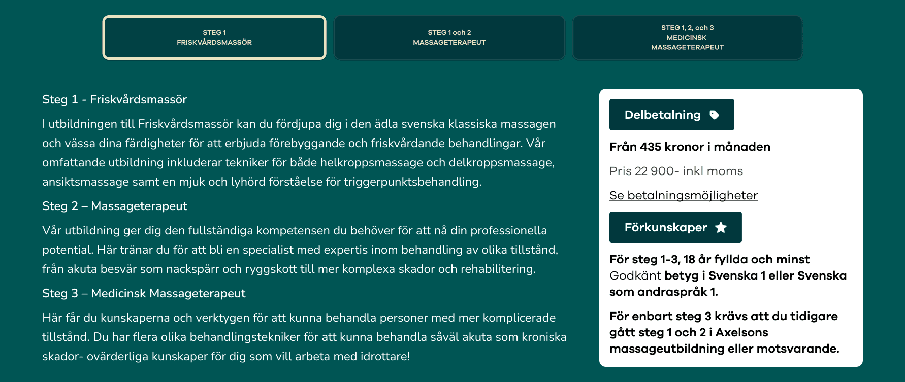
Merging step 1-3
We wanted the CTA to work a bit smoother with the new CTA so we decided to merge all the steps into one page where the user could easily navigate the three different steps. Before the user had to go back and forth to read about the difference with the courses and their respective learning points. We wanted it to be more intuitive and collected to avoid the user from bouncing around too much
Course cards
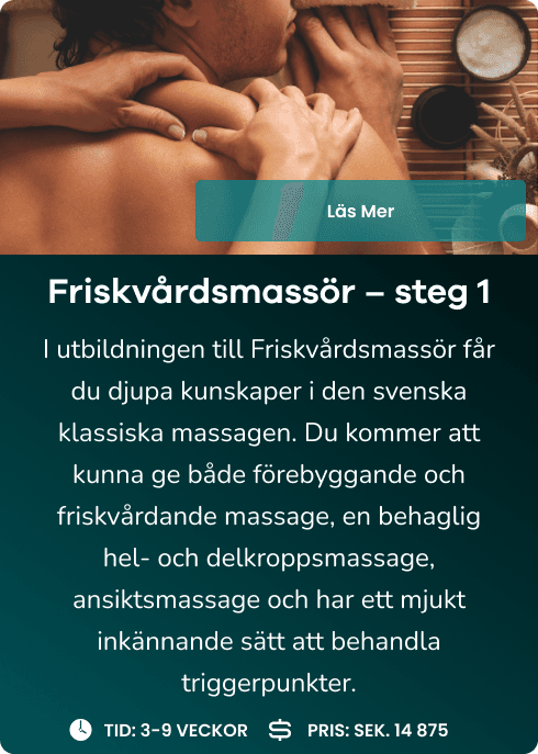
The course cards took up too much space on the site so we aimed to make them smaller with less text and add important information so the user could easily see the relevant information on pricing and length of the course. We also changed how to present the length of a course; from the amount of hours to the amount of weeks/days. We also added a filter so the user could sort out the longer ones from the shorter ones so the page didn't feel as busy.


Calendar
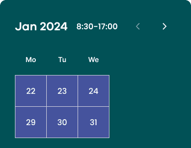
The calendar was difficult to read and took up too much space on the website. We wanted to show the days more than tell the user what day it was so they got a better idea of what times and what days they would be attending school and what days they would not.

Testimonials
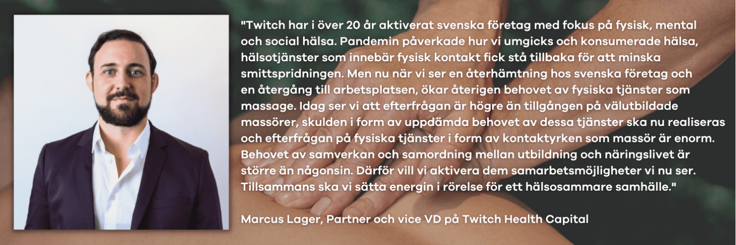
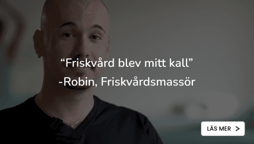
There is one testimonial on the bottom of the massage page from a company. The testimonial is filled with text and does not really tell the story of how and why a course at Axelsons will give both knowledge and perhaps a new occupation. Axelsons also had articles from previous students that they wanted to use so we decided to add them as testimonials for social proof.
Personal comments and learning points:
Me and one colleague focused on the design for Axelsons website and made the decision to work through atomic design. This is a system we recently learnt of and wanted to test out. Whilst it was stressful relearning how to structure our UI design it is something I am quite happy with trying out and a system I want to get a bit deeper in.
I am happy with our solution and the problems we uncovered but if I could go back in time and change one thing with the project it’s the time we spent on ideation. There can never be enough ideation but we should have spent more time on it and from now I will make sure to push for a longer ideation process
I have worked with clients where I don't enjoy the work as much as I did here. This really helped underline how many factors can help with the enjoyment of the whole UX process. Sure, 11 weeks were tiring but I enjoyed each step of the process because I have personally studied at Axelsons and have a passion for working through holistic processes. If holism is through designing a meaningful experience that leaves a mark on society or through how the whole body is connected. Working with Axelsons felt like a full circle for me and I can not articulate how much I enjoyed the process.
This is a case study that isn’t made with research in mind, however if you want to read about our research more in-depth I would recommend my colleague Nour Faheds case study on Axelsons which can be found here